Snapkin brand assets
Every logo, every banner, the colour codes, and a paragraph you can paste straight into your post. If you're writing about Snapkin, reviewing it, listing it somewhere, ... take what you need. No permission to ask for and no form to fill in first.
SVG and PNG, plus the four banners. Everything on this page is in that one file.

The short version
- What it is
- A calorie tracker you use by photographing your plate
- Platforms
- iPhone and Android
- Price
- €14.99 a month, or €99.99 a year
- Languages
- 10
- Made by
- Robot Studios IT Consultancy BV, Belgium
- Press contact
- [email protected]
The logo
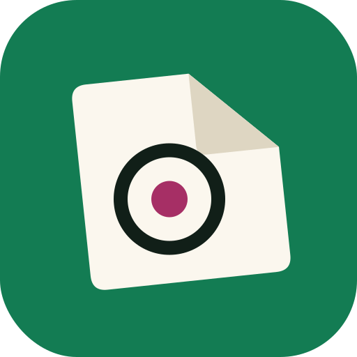
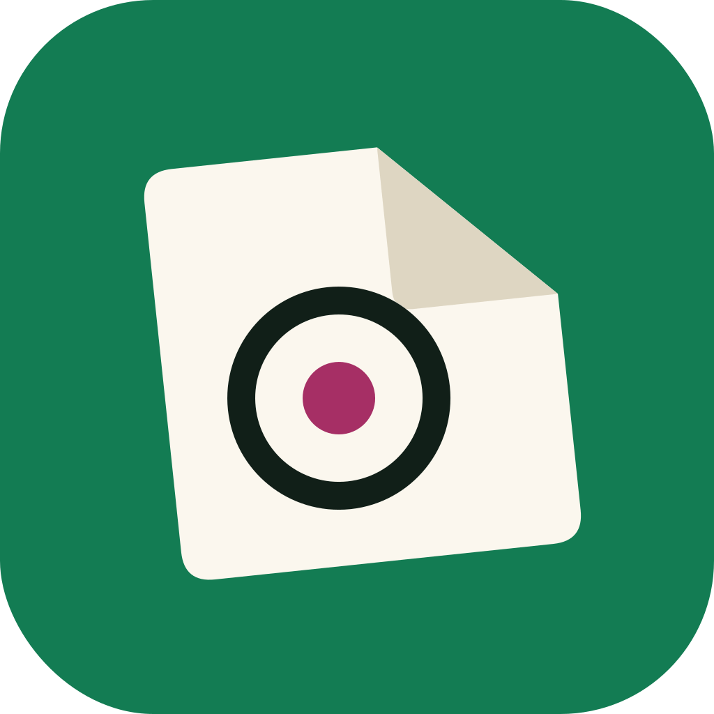
The mark is a folded napkin with a plate on it, seen through a camera shutter. It's drawn once, in one file, and a script makes every size and format below it. This way you can't end up with an old one. Whatever you download here is the one I'm using today.
Horizontal
The default. Use it wherever you've got more width than height: a header, a footer, a sponsor row, ...
Stacked
For a square-ish space. Also for anything so small that the horizontal one would drop the wordmark under 12px, where it becomes unreadable.


The mark and the wordmark, separately
The mark on its own is for an avatar, a favicon, an app-icon slot, ... The wordmark on its own is for somewhere that's already said who I am.


The mark as a transparent PNG: 256px, 512px, 1024px. Need a size or a format that isn't here? Ask, and you'll have it the same day.
Room around it
Leave a quarter of the mark's height clear on every side. Nothing goes in there. Not your own logo, not a caption, not the edge of the page, ...
How small it goes
The mark holds up down to 24px. The horizontal logo doesn't: under about 120px wide it sets the wordmark too small to read. Switch to the mark on its own rather than shrinking it any further.
Please do not
- Re-colour the tile. And don't put it on a mid-green background, where its own green vanishes.
- Rotate it. The napkin in there is already tilted six degrees. That's the drawing, not a scan I forgot to straighten.
- Stretch it, outline it, drop-shadow it, or nest it inside a second rounded box.
- Set the wordmark in some other typeface, or rebuild the logo yourself by typing "snapkin" next to the mark.
- Write it as SnapKin, Snap Kin, or Snapkin AI.
Colour
Paper, ink and three bright colours. Every value below has a job, so the same colour means the same thing on the site, in the app and in the store pictures. None of them are in there because I liked the look of them.
The brand
Green is the main colour. Raspberry and yellow are accents, and never the main action.
- Brand green #0B7A4E Buttons, links, the app icon. The main colour.
- Bright green #12A36B Rings, chips, small marks. Not for body text.
- Section green #0D724B Whole bands of colour, where white text still has to be readable.
- Raspberry #E5397D Stickers and highlights. The dot in the mark.
- Raspberry, read #B8215C A pink word on a pale background. The brighter one fails the contrast test.
- Yellow #FFD23F The highlighter, and an unanswered question in the app.
- Paper #FFF9EC The page. Warm white, never pure white.
- Ink #15201A All body text and headings.
The nutrients, inside the app
One colour per nutrient, so you know which dial you're looking at before you read the label. Protein gets the brand green because it's the one you're aiming to hit, not the one you're trying to stay under.
- Protein #0B7A4E The big dial. A target to reach, not a limit to stay under.
- Carbohydrates #0A8F98 Carbohydrate readings and dots.
- Added sugar #5C6B12 Added sugar only. Never total sugar.
- Fat #6C5CE7 Fat readings and dots.
The one that catches people
Bright green can't be used for body text. White on #12A36B measures 3.24:1 and a paragraph needs 4.5:1, so anything painted green across a whole section gets #0D724B instead. Raspberry has the same problem the other way round: #E5397D is 4.03:1 on white, so a pink word on a pale background is #B8215C. I got both of these wrong on this very page, and the contrast check is what caught it.
In the dark
Every colour has a counterpart for dark backgrounds. Green becomes #2ED18B, paper #161A17, ink #EEF0E8. And colour is never the only signal in the app: a finished dial shows a tick and a sentence as well as the fill.
Three typefaces, one job each
All three are free fonts under the SIL Open Font License and all three are on Google Fonts, so you can set a headline in Bricolage yourself if you want to. The text inside the app is deliberately none of them. The app uses the font the phone already has.
Banners
Four pictures, each one sized for the place it goes. These are the real files, copied straight out of the store listing and the mail template. I didn't redraw anything for this page.
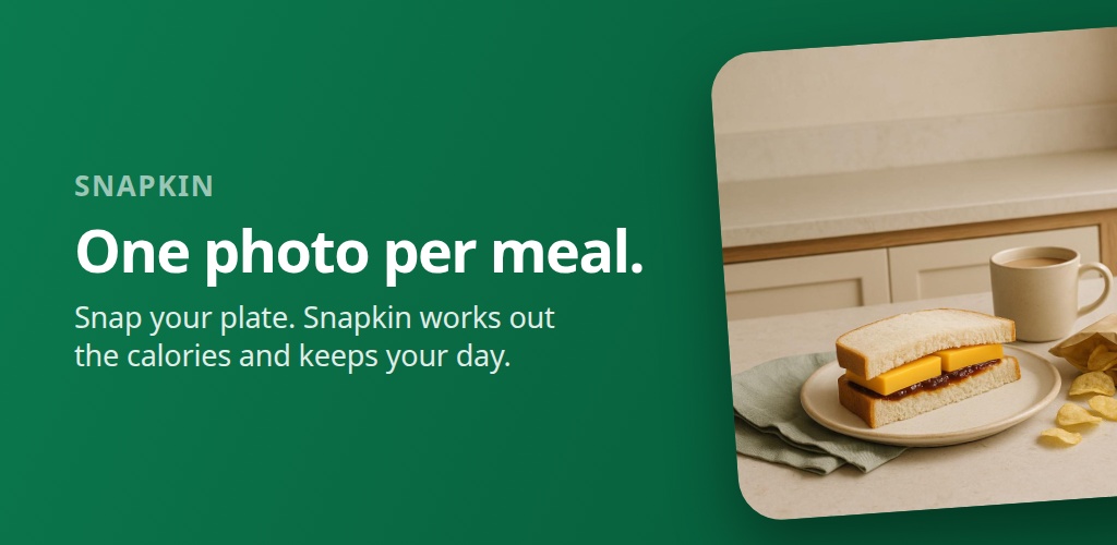
The Google Play feature graphic, which is the first picture on the listing. Play crops the outer edges on some layouts and puts a play button over the middle on others, so everything you actually have to read sits in a band well inside both.
Download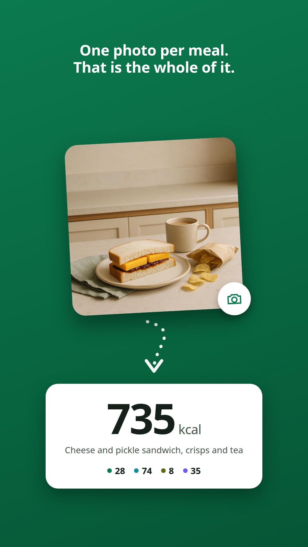
The first screenshot on the Play listing. It's the one picture that explains the whole thing without a sentence: a photo, an arrow, and the number that came out of it.
Download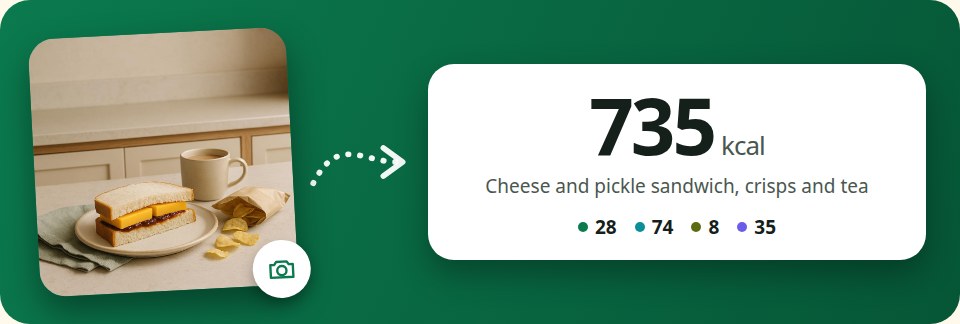
The strip at the top of every mail Snapkin sends. Same three parts as the tall one, laid across instead of down, so the heading and the button are still visible before you scroll. Drawn at 480px, saved at twice that so it stays sharp on a phone.
Download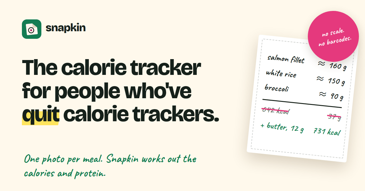
The Open Graph card. It's the preview a link to getsnapkin.app turns into on a timeline or in a chat.
DownloadAll four exist in the other languages too. The email banner in 10, the store pictures in thirteen markets, each one with a meal photographed for that market rather than the same sandwich with a translated caption. Ask and I'll send you the one you need.
Words you can paste
Written to be pasted exactly as they are. Need it shorter? Drop a paragraph rather than rewriting the claims. Every number in here is one I can back up, and I'd much rather you quoted me than paraphrased me into something I didn't say.
The name
Snapkin. One p, capital S, nothing else capitalised. It's a napkin and a snap. That's the whole joke. Not SnapKin, not Snap Kin, and please not Snapkin AI.
One line
Snapkin is a calorie tracker you use by photographing your plate.
One paragraph
Snapkin is a calorie tracker you use by photographing your plate. There's no scale to weigh with, no barcode to scan and no database to search: take one photo per meal, and Snapkin works out what is on the plate, what it comes to in calories, and how much protein you have had today. It runs on iPhone and Android in 10 languages, and costs €14.99 a month or €99.99 a year.
Three paragraphs
Snapkin is a calorie tracker built on one observation: people do not quit calorie trackers because the numbers are wrong, they quit because the logging is work. Weighing rice, scanning barcodes and picking the right oatmeal out of a list of fourteen takes a few minutes a meal, several times a day, and almost nobody keeps that up past the second week. Snapkin asks for one thing instead, a photograph of the plate, and does the rest itself.
Photograph a meal and it names what is on it, estimates the portions against the plate and the cutlery beside them, counts the fat it was cooked in, and adds the result to the day. Where it isn't sure it asks a single question about whatever would move the number most, and it writes the answer down as one plain sentence you can read, edit or delete, so it asks less about your kitchen every week. It puts protein first, because when you are eating less than you burn, protein is what decides how much of the weight you lose is fat rather than muscle. None of the estimate is dressed up as a measurement: the app shows what it assumed and lets you correct it, and the published evidence, including the studies that argue against tracking, is written up in full at getsnapkin.app/en/research.
Snapkin is made by Robot Studios IT Consultancy BV, an independent software company in Belgium, and it is paid for by the people who use it: €14.99 a month or €99.99 a year, one subscription, no free tier and nothing extra to buy later. There's no advertising, no analytics and no tracking anywhere in the app or on the website. Food diaries are not sold, not shared with advertisers and not used as training data. Everything can be deleted from inside the app in a few taps. It runs on iPhone and Android in 10 languages.
Writing about Snapkin?
Mail [email protected] and a person answers, not a ticket queue. That's the right address for a screenshot you can't find, a review account, a fact you want checked before you print it, or a question about any number on this site.